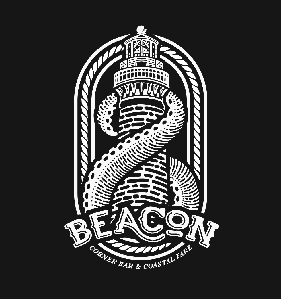
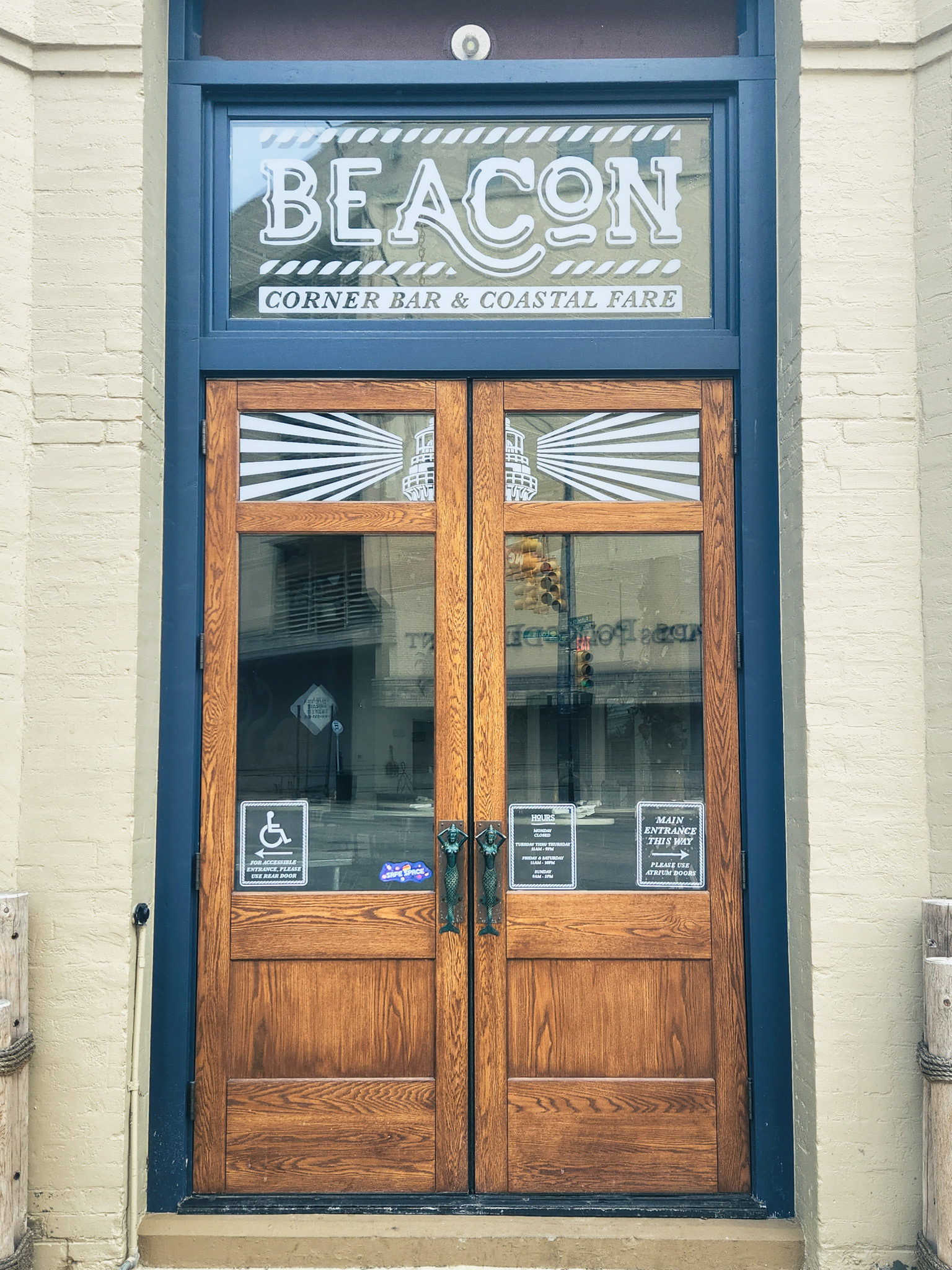
I had the pleasure of being approached by the owners of Grand Rapids' newest seafood and cocktail bar, Beacon, to help develop a logo and window treatments for their location downtown. They wanted to create an identity that was nautical, playful and family-friendly.
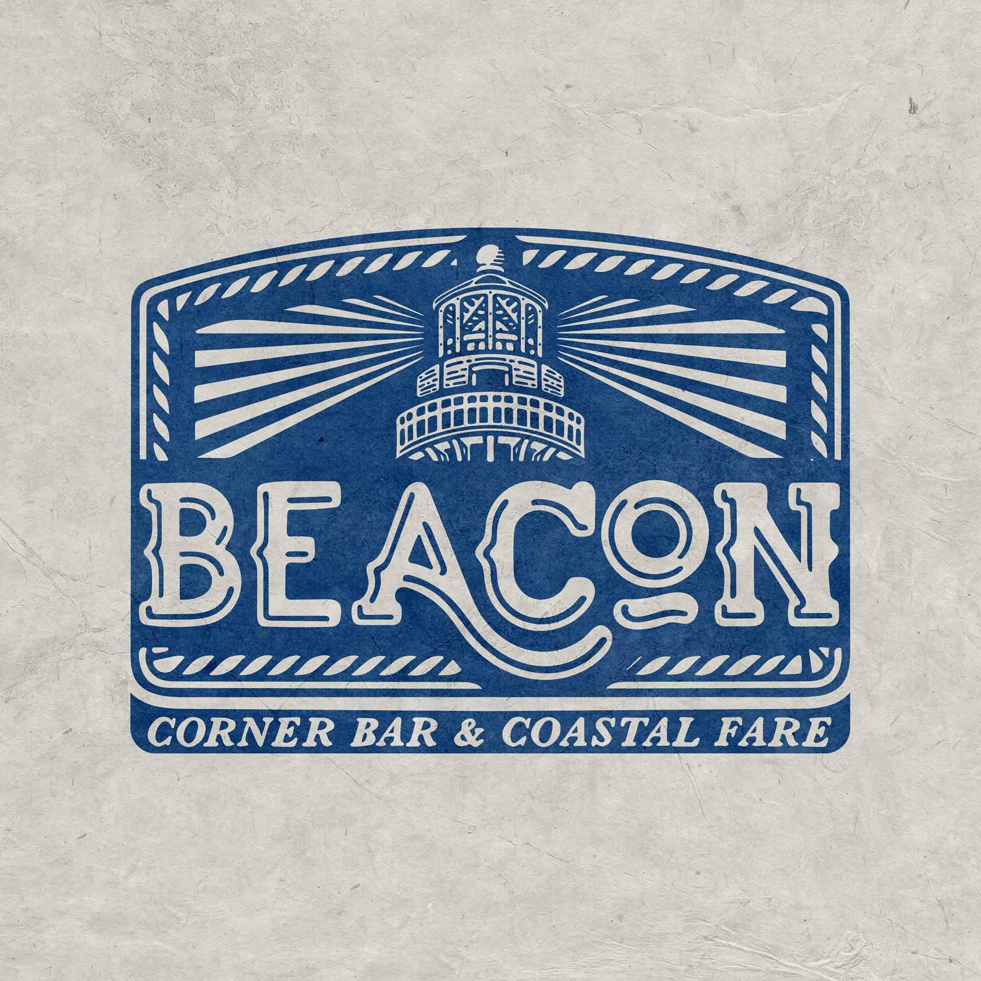
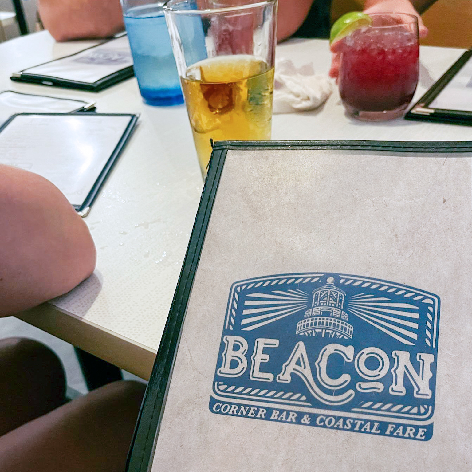
a strong emphasis on Illustrative elements was placed throughout the project and, after a long exploration process, we finally found a style that everyone was happy with. A middle ground between a cleaner minimalist mark and a more antiquated woodcut type of style that was reminiscent of a salty old saloon.
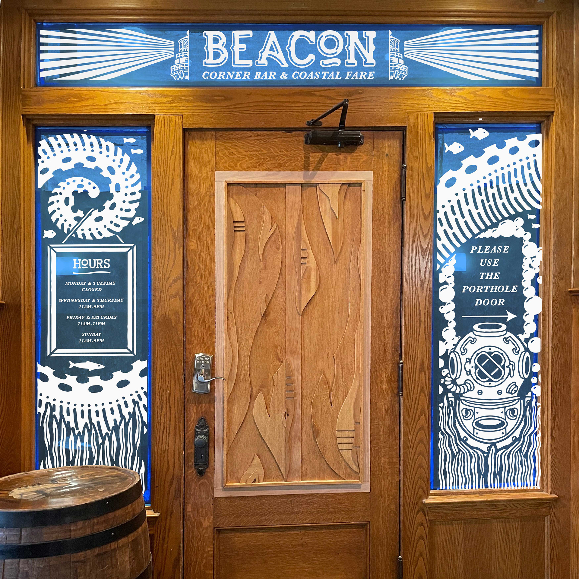
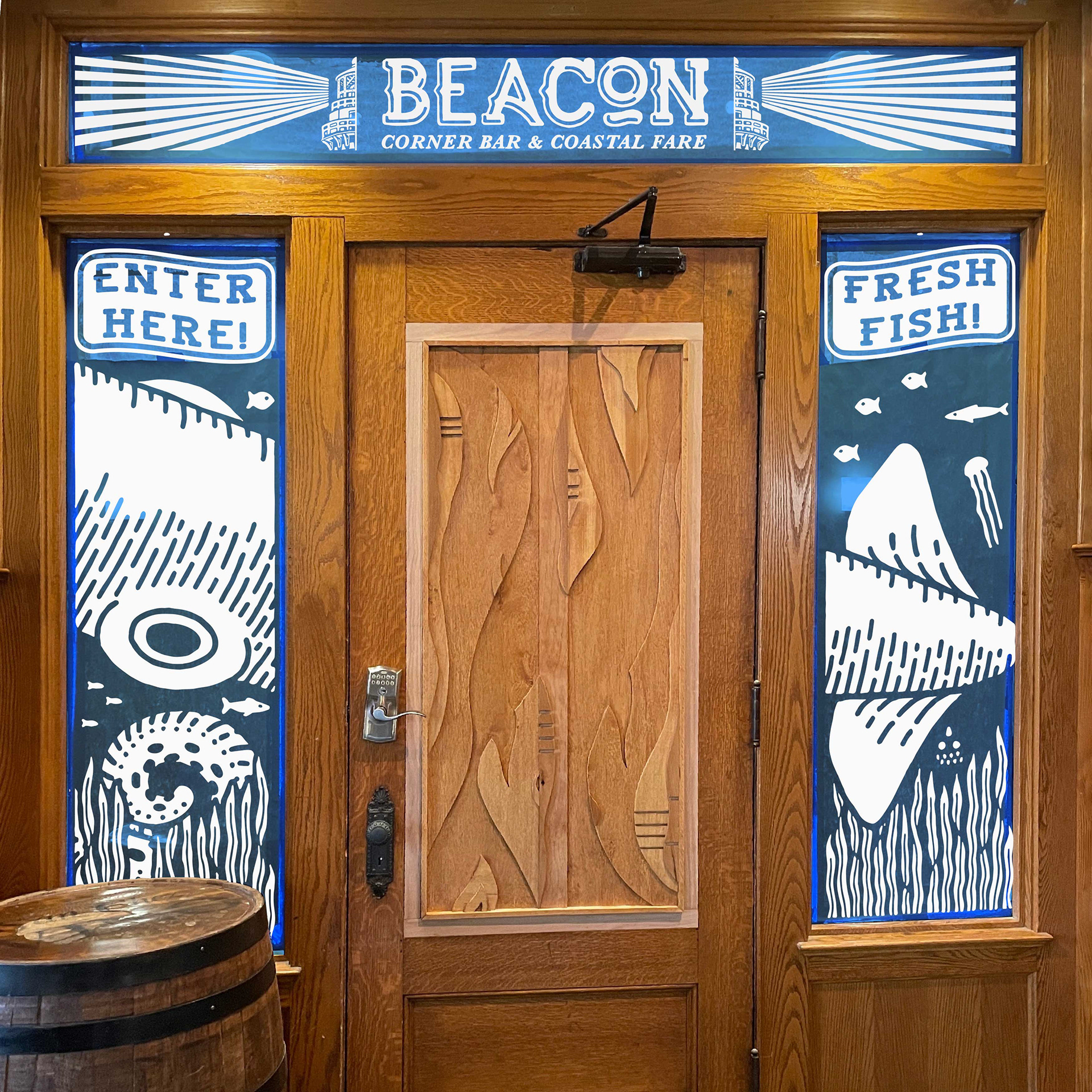
The window vinyl for the entrance windows inside the lobby was a fun challenge! A little bit of information and wayfinding requested, but 90% blank canvas to fill. We ended up going forward with this 4 window spread of a giant (friendly) squid and some other characters peeking through the glass. It's best viewed on location to get the scale and context between the doors.
A secondary challenge with this step was that we originally had white vinyl on clear windows and the legibility suffered during the evening hours, when the restaurant lights were on. They asked me if I could think of any solutions without having to remove/reapply the graphics, so I suggested something I had never tried before. We applied a dark blue vinyl background to the interior of the windows. This gave the white vinyl on the outside of the windows a darker color to pop off of, but also created a bit of a dimensional effect to the graphics, as they hovered above the blue slightly.
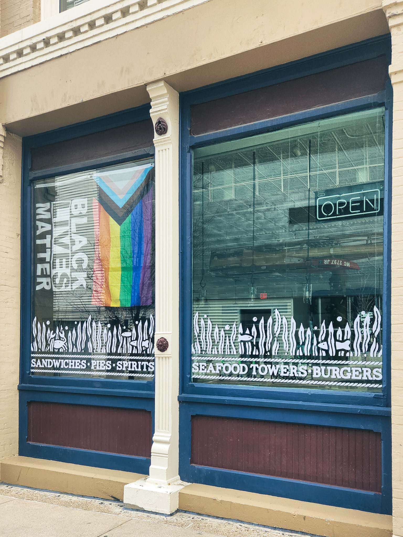
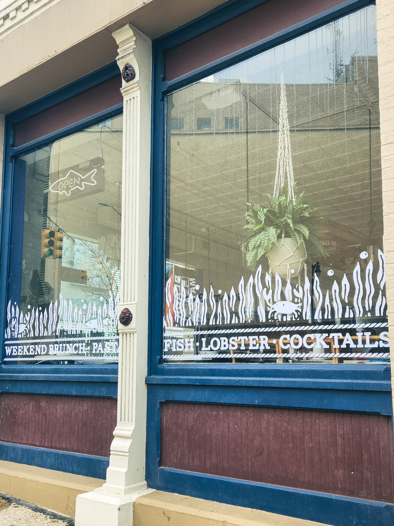
They wanted the outdoor windows to achieve 3 objectives: communicate menu offerings to people passing by, provide a slight privacy barrier to the customers from curious pedestrians and also match the style of the lobby windows in some way. Seaweed curtains with some little sea creatures and a simple marquee ended up as our winner.
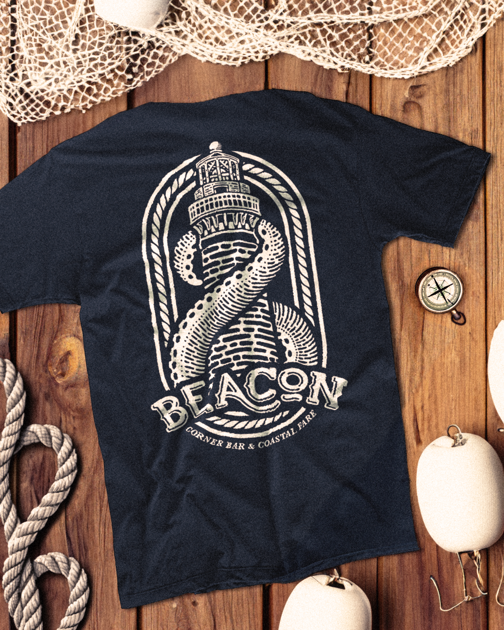
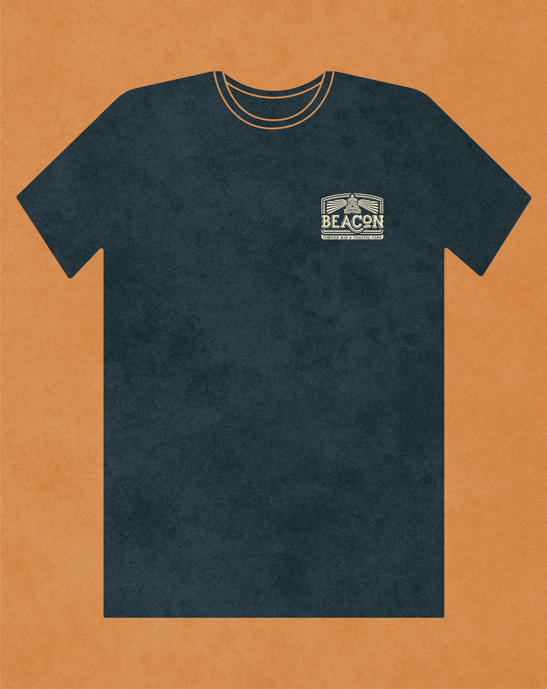
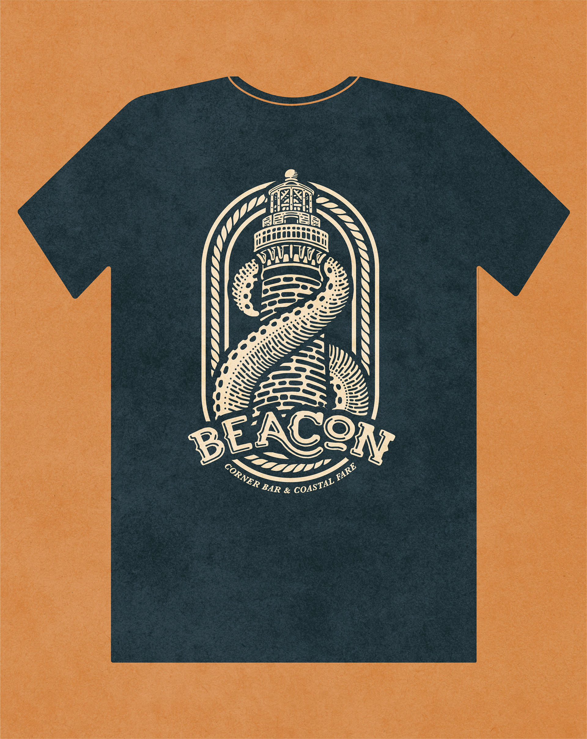
Set to debut in 2024, Beacon requested a new design for their employee t-shirts that fit with their other illustrated deliverables. This was based off a concept that was floated during our initial logo explorations and then revived and refined to be used as an apparel graphic. It incorporates multiple elements found around the restaurant: the lighthouse head from the logo, The tentacle from the lobby entrance, and the rope pattern found in a number of their branded materials.
